Creating a visual identity for Viadukt Karlín
Public (open) design competition
Public (open) design competition
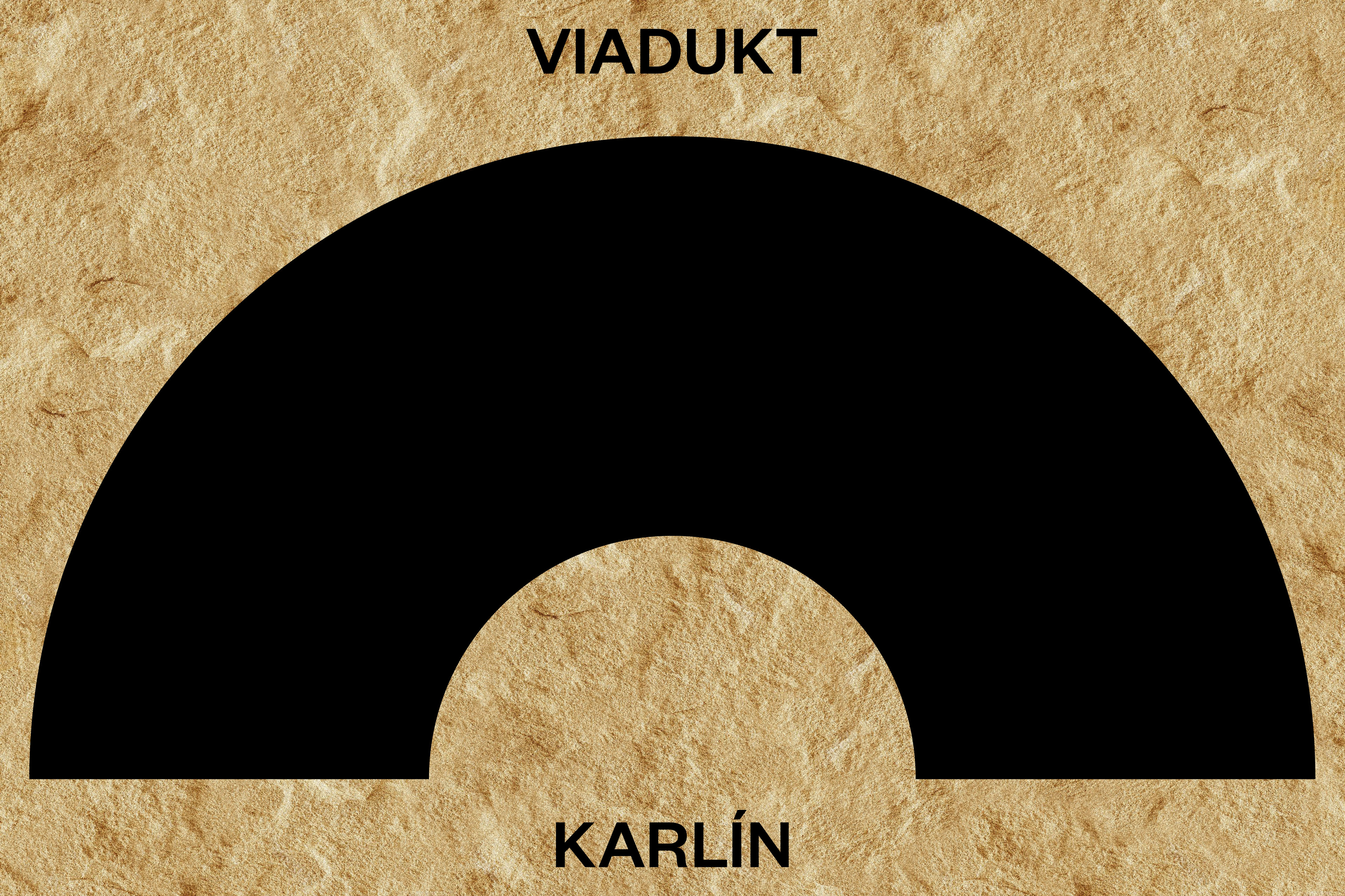
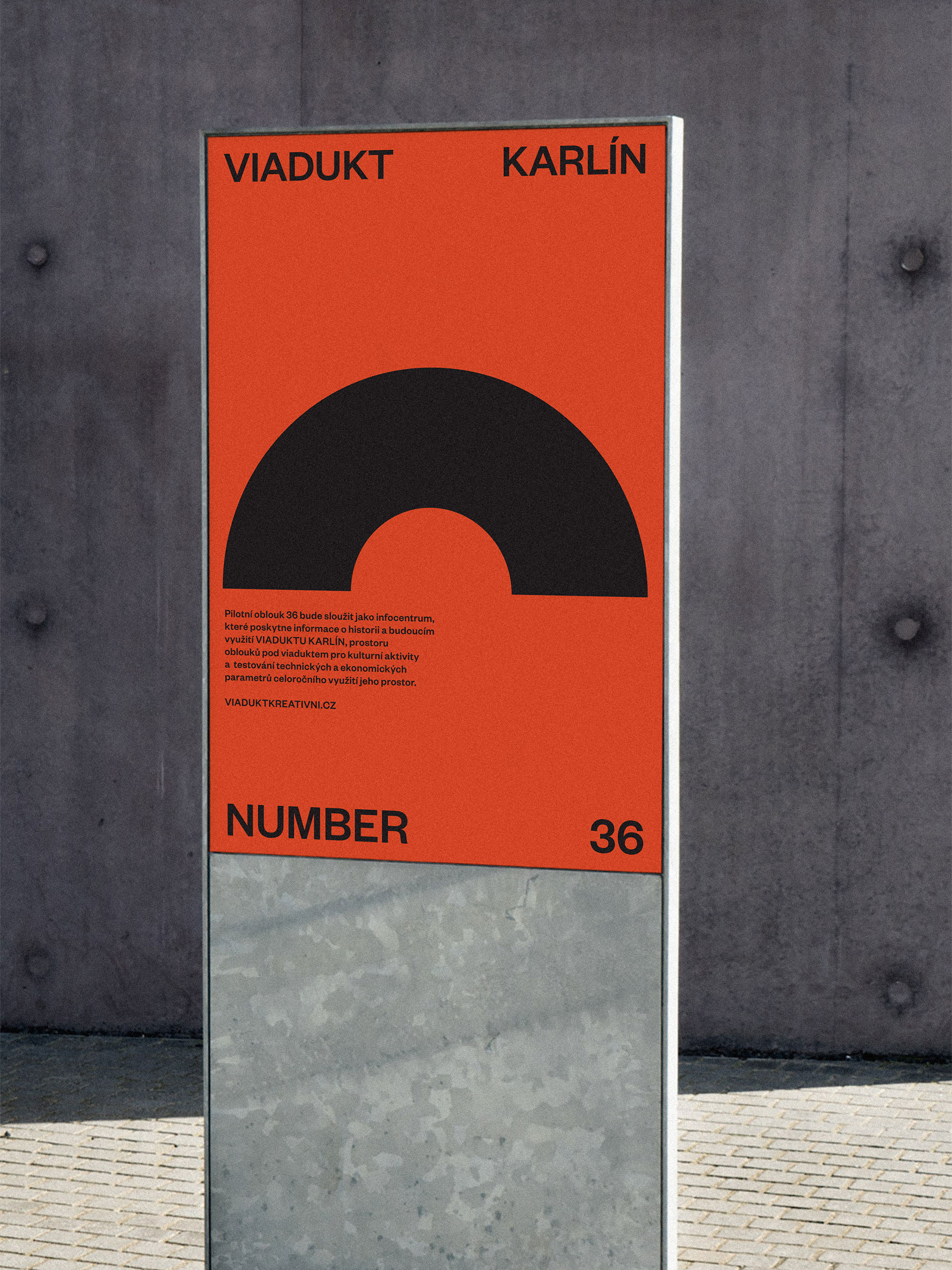
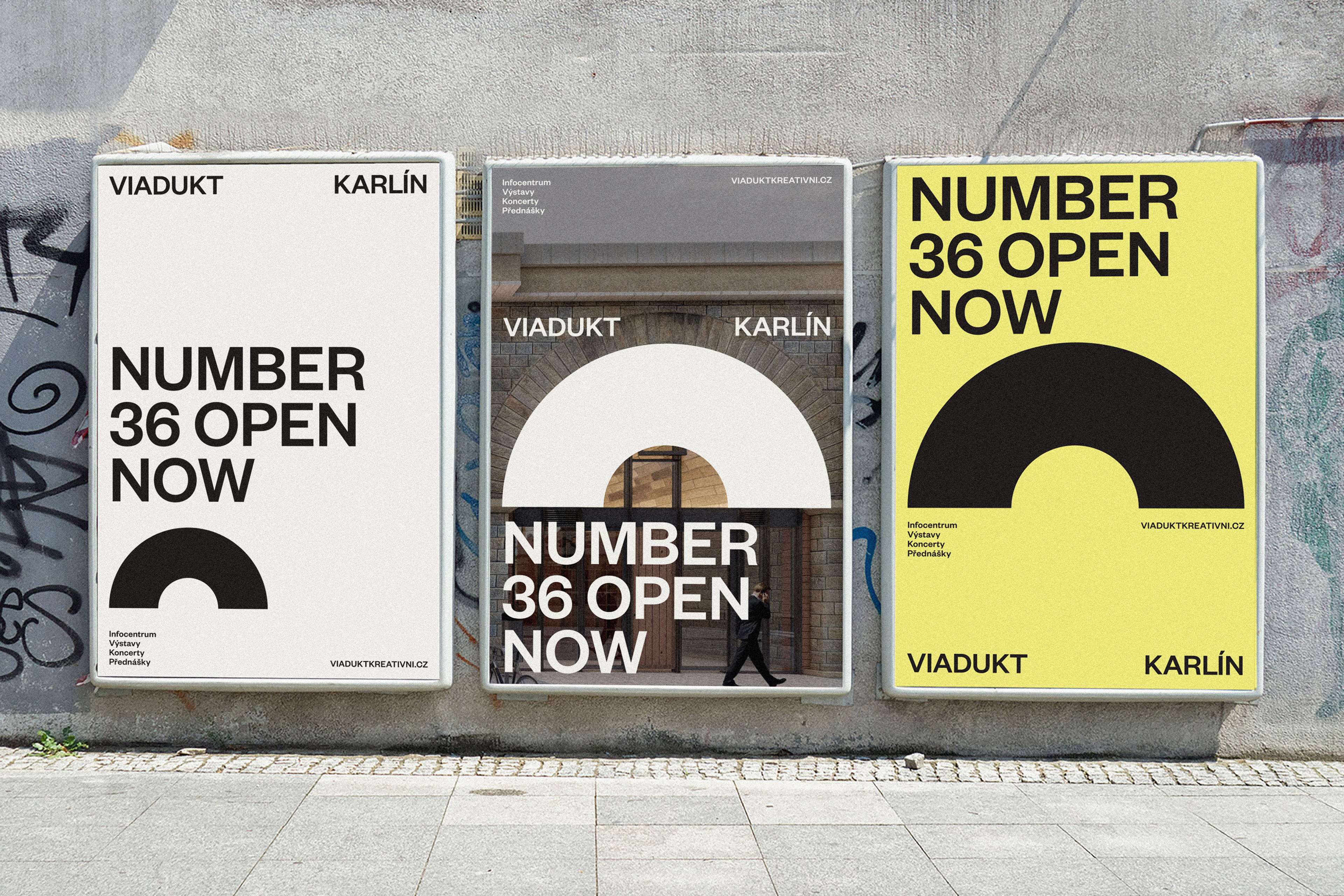
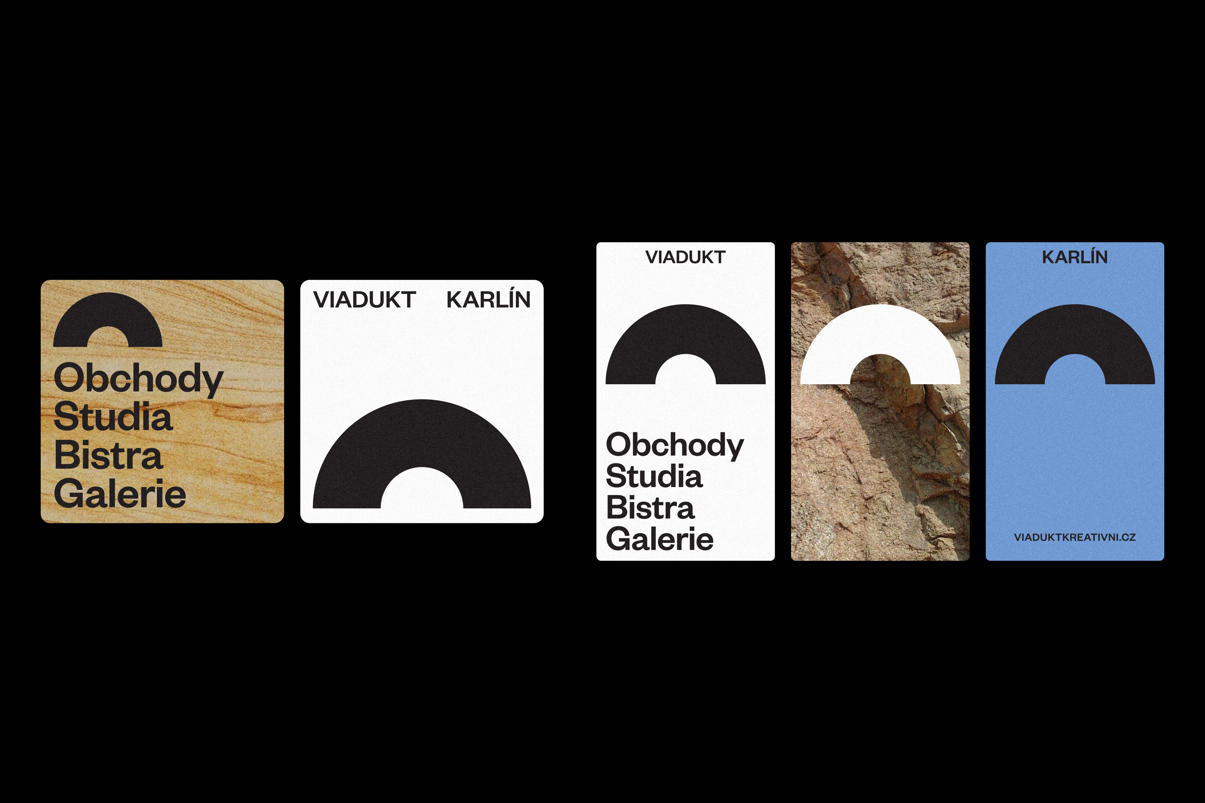
Two Vltava banks, viaduct, arch. The tension that can be read in the name Viadukt Karlín became the basis of the brand and visual style. The arch as a graphic symbol that connects what has been separated. New Town and Karlín, the banks of the river, the Viaduct with the people. A geometrically constructed graphic abbreviation of the space under the viaduct as a connecting element across the identity. The emphasis is on purity of design with reference to the architectural and historical value of the building. The unity of style is maintained by the timeless Fouders Grotesk typeface by Klim Type Foundry, which makes the brand principle easy to write into the typesetting of texts and communication in printed and online materials. The work with composition and colour is designed with an accent on variability, reflecting the diversity of utilization of individual arches. This dynamism is supported by the changing textures of the Viaduct materials used in contrast to the new strong identifying element, the symbol of the arch, which connects all.
client
Trade Centre Praha a.s.
typeface
Founders Grotesk Family
designer
Anna Divišová
scope
Branding & Visual identity, Digital
2nd place in the competition
Back


Viadukt Karlín
Branding & Identity
Info